Lack of contrast: Difference between revisions
Created page with "= <center>Prey 2006</center> = <div class="jcarousel-wrapper"> <div class="jcarousel"> <div class="jcarousel-list"> <div class="jcarousel-item"> <center>900px</center> <center>''Level 16''</center> </div> <div class="jcarousel-item"> <center>900px</center> <center>''Level 16''</center> </div> </div> </div> <span class="jcarousel-control-prev">‹</span> <..." |
No edit summary |
||
| (One intermediate revision by the same user not shown) | |||
| Line 5: | Line 5: | ||
<div class="jcarousel-list"> | <div class="jcarousel-list"> | ||
<div class="jcarousel-item"> | <div class="jcarousel-item"> | ||
<center>[[image: | <center>[[image:prey2006_contrast3.jpg|900px]]</center> | ||
</div> | </div> | ||
<div class="jcarousel-item"> | <div class="jcarousel-item"> | ||
<center>[[image: | <center>[[image:prey2006_contrast4.jpg|900px]]</center> | ||
</div> | </div> | ||
</div> | </div> | ||
| Line 19: | Line 17: | ||
</div> | </div> | ||
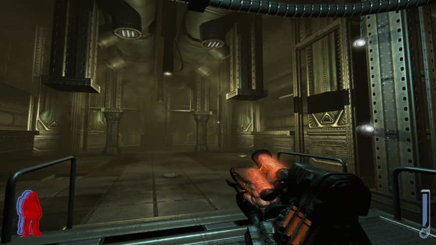
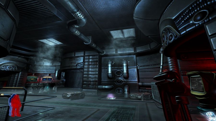
This game suffers from lack of contrast. The environments are excessively monotonic, monochromatic. Everything is too flat, making it hard to recognize and identify objects and paths. There isn't a good contrast between light and dark which makes it hard to have perception of depth. | |||
One solution is to use lights that highlight some parts, such as the pipes on the walls for example. Another technique is having good contrast of the textures themselves so that the player can easily "read" them. | |||
= <center> | = <center>Dark Forces</center> = | ||
<div class="jcarousel-wrapper"> | <div class="jcarousel-wrapper"> | ||
| Line 29: | Line 27: | ||
<div class="jcarousel-list"> | <div class="jcarousel-list"> | ||
<div class="jcarousel-item"> | <div class="jcarousel-item"> | ||
<center>[[image: | <center>[[image:darkforces_contrast1.jpg|900px]]</center> | ||
<center>''Robotics Facility mission''</center> | |||
</div> | </div> | ||
<div class="jcarousel-item"> | <div class="jcarousel-item"> | ||
<center>[[image: | <center>[[image:darkforces_contrast2.jpg|900px]]</center> | ||
<center>''Robotics Facility mission''</center> | |||
</div> | |||
<div class="jcarousel-item"> | |||
<center>[[image:darkforces_contrast3.jpg|900px]]</center> | |||
<center>''Imperial City mission''</center> | |||
</div> | </div> | ||
</div> | </div> | ||
| Line 41: | Line 45: | ||
</div> | </div> | ||
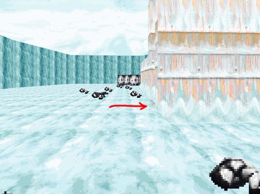
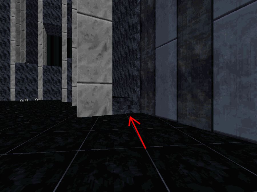
'''Robotics Facility mission.''' Can you notice the staircase there? It's almost invisible due to the low contrast of it. The player can very well run in circles for a long time before noticing that there is a staircase there. | |||
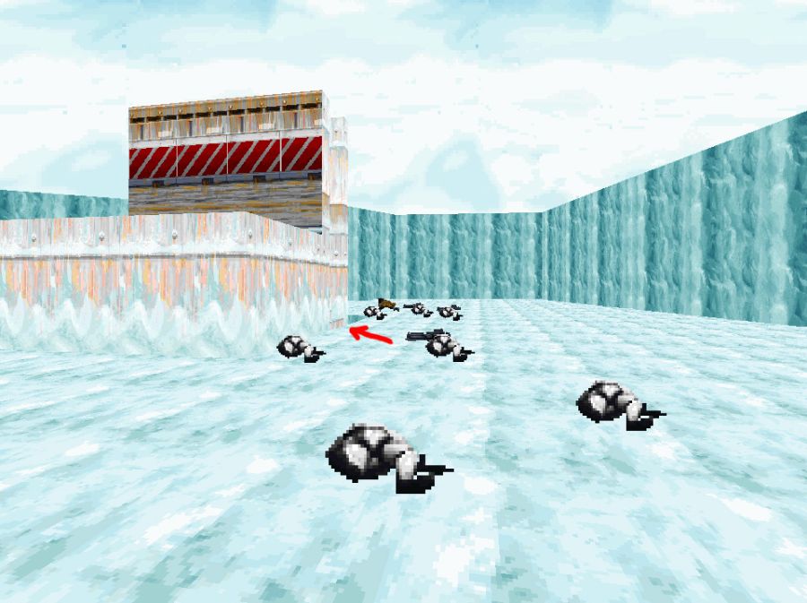
The | '''Imperial City mission.''' The path to follow is this lift, but the low contrast prevents the player from noticing it. It's hard to notice the lift in this corner. | ||
= <center> | = <center>Rise of The Triad 2013</center> = | ||
<div class="jcarousel-wrapper"> | <div class="jcarousel-wrapper"> | ||
| Line 51: | Line 55: | ||
<div class="jcarousel-list"> | <div class="jcarousel-list"> | ||
<div class="jcarousel-item"> | <div class="jcarousel-item"> | ||
<center>[[image: | <center>[[image:rott2013_contrast1.jpg|900px]]</center> | ||
<center>''Image credits: [https://www.youtube.com/watch?v=-7OOGaThz3k| World of Longplays]''</center> | |||
</div> | |||
<div class="jcarousel-item"> | |||
<center>[[image:rott2013_contrast2.jpg|900px]]</center> | |||
<center>''Image credits: [https://www.youtube.com/watch?v=-7OOGaThz3k| World of Longplays]''</center> | |||
</div> | </div> | ||
<div class="jcarousel-item"> | <div class="jcarousel-item"> | ||
<center>[[image: | <center>[[image:rott2013_contrast3.jpg|900px]]</center> | ||
<center>''Image credits: [https://www.youtube.com/watch?v=-7OOGaThz3k| World of Longplays]''</center> | |||
</div> | |||
<div class="jcarousel-item"> | |||
<center>[[image:rott2013_contrast4.jpg|900px]]</center> | |||
<center>''Image credits: [https://www.youtube.com/watch?v=-7OOGaThz3k| World of Longplays]''</center> | |||
</div> | |||
<div class="jcarousel-item"> | |||
<center>[[image:rott2013_contrast5.jpg|900px]]</center> | |||
<center>''Image credits: [https://www.youtube.com/watch?v=-7OOGaThz3k| World of Longplays]''</center> | |||
</div> | |||
<div class="jcarousel-item"> | |||
<center>[[image:rott2013_contrast6.jpg|900px]]</center> | |||
<center>''Image credits: [https://www.youtube.com/watch?v=-7OOGaThz3k| World of Longplays]''</center> | |||
</div> | |||
<div class="jcarousel-item"> | |||
<center>[[image:rott2013_contrast6.jpg|900px]]</center> | |||
<center>''Image credits: [https://www.youtube.com/watch?v=-7OOGaThz3k| World of Longplays]''</center> | |||
</div> | </div> | ||
<div class="jcarousel-item"> | <div class="jcarousel-item"> | ||
<center>[[image: | <center>[[image:rott2013_contrast7.jpg|900px]]</center> | ||
<center>'' | <center>''Image credits: [https://www.youtube.com/watch?v=-7OOGaThz3k| World of Longplays]''</center> | ||
</div> | </div> | ||
<div class="jcarousel-item"> | <div class="jcarousel-item"> | ||
<center>[[image: | <center>[[image:rott2013_contrast8.jpg|900px]]</center> | ||
<center>'' | <center>''Image credits: [https://www.youtube.com/watch?v=-7OOGaThz3k| World of Longplays]''</center> | ||
</div> | </div> | ||
</div> | </div> | ||
| Line 85: | Line 97: | ||
</div> | </div> | ||
This game was made with Unreal Engine 3, but compare it to Bioshock Infinite for example. Bioshock Infinite had a much better art direction. ROTT 2013 is a remake of the game of the same name from 1995. Compare ROTT 2013 with Prey 2006. They run on different engines, yet they suffer from the same low contrast issue. This is to say that the art direction plays a much more important role in how the game looks and how its environments are read than the technology itself. For example: red lights meant to signal something important are very much saturated. If the red lights are desaturated as in ROTT 2013's second level, they lose their importance. | |||
The excess of colors create too much contrast and becomes confusing to the player's eyes. The extreme opposite, the same color everywhere, creates a boring scene and uninteresting places. | |||
[[Category:Level_Design]] | |||
Latest revision as of 19:31, 7 November 2025
Prey 2006
This game suffers from lack of contrast. The environments are excessively monotonic, monochromatic. Everything is too flat, making it hard to recognize and identify objects and paths. There isn't a good contrast between light and dark which makes it hard to have perception of depth.
One solution is to use lights that highlight some parts, such as the pipes on the walls for example. Another technique is having good contrast of the textures themselves so that the player can easily "read" them.
Dark Forces
Robotics Facility mission. Can you notice the staircase there? It's almost invisible due to the low contrast of it. The player can very well run in circles for a long time before noticing that there is a staircase there.
Imperial City mission. The path to follow is this lift, but the low contrast prevents the player from noticing it. It's hard to notice the lift in this corner.
Rise of The Triad 2013


This game was made with Unreal Engine 3, but compare it to Bioshock Infinite for example. Bioshock Infinite had a much better art direction. ROTT 2013 is a remake of the game of the same name from 1995. Compare ROTT 2013 with Prey 2006. They run on different engines, yet they suffer from the same low contrast issue. This is to say that the art direction plays a much more important role in how the game looks and how its environments are read than the technology itself. For example: red lights meant to signal something important are very much saturated. If the red lights are desaturated as in ROTT 2013's second level, they lose their importance.
The excess of colors create too much contrast and becomes confusing to the player's eyes. The extreme opposite, the same color everywhere, creates a boring scene and uninteresting places.
